Your code editor theme is more than just aesthetics - it affects readability, focus, and even your mood while coding. Here are 10 gorgeous themes that developers love.
1. One Dark Pro
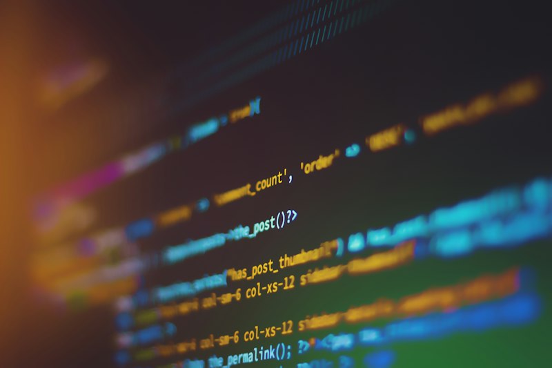
The most popular dark theme on VS Code marketplace with over 15 million downloads. Features carefully balanced contrast with vibrant syntax highlighting.
- Best for: Long coding sessions
- Eye strain: Low
2. Dracula
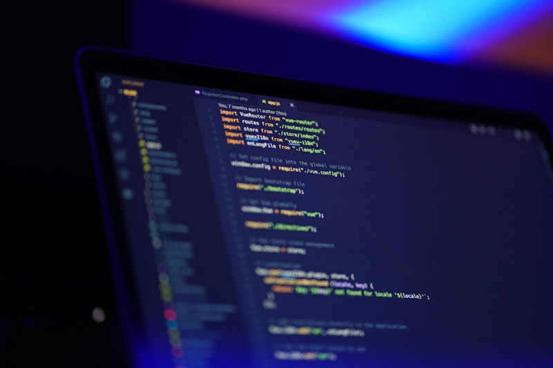
A dark theme with a purple-tinted palette. Available for virtually every editor and terminal. The consistent color scheme across tools is its biggest advantage.
3. GitHub Theme
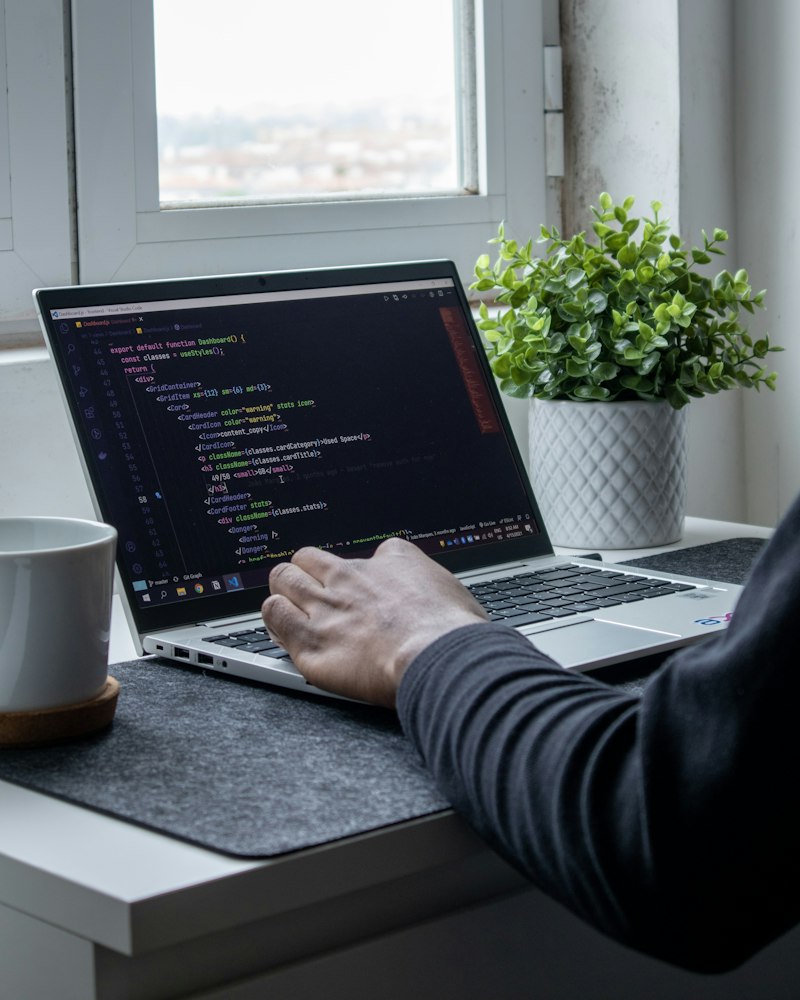
If you love GitHub's code rendering, this theme brings that clean, familiar look to your editor. Available in both light and dark variants.
4. Tokyo Night
A clean Visual Studio Code theme that celebrates the lights of downtown Tokyo at night. Features a beautiful dark blue background with bright, readable syntax colors.
5. Catppuccin
A community-driven pastel theme with 4 flavor variants: Latte (light), Frappe, Macchiato, and Mocha (darkest). Soothing color palette that reduces eye strain.
6. Gruvbox
Retro groove color scheme inspired by vintage terminals. Warm, earthy tones that are surprisingly easy on the eyes. Available in light and dark.
7. Nord
An arctic, north-bluish color palette. Minimal and clean with a focus on readability. Great for developers who prefer muted, calm colors.
8. Monokai Pro
The premium evolution of the classic Monokai theme. Sophisticated color palette with multiple filter options for different moods.
9. Synthwave '84
A retrowave-inspired theme with neon glow effects. Perfect for when you want your code to look like it's from a sci-fi movie. Includes optional glow effect!
10. Palenight
An elegant and juicy Material Design-like dark theme. Soft colors with excellent contrast ratios, making it accessible and beautiful.
How to Choose the Right Theme
- Consider your environment - Dark themes for dim rooms, light for bright offices
- Test for readability - Can you easily distinguish different syntax elements?
- Check contrast ratios - Higher contrast reduces eye strain
- Try it for a week - Don't judge a theme in 5 minutes

No comments yet. Be the first!